| T H E A R T P A R T Y |
| a b o u t ! ~ a r t ! ~ i s s u e s ! ~ p r o p a g a n d a ! ~ j o i n ! ~ e v e n t s ! ~ c o n t a c t ! |
|
MOTION THOUGHTS Among these pages you are invited to explore the work of Art Party members. We hope you feel a little more inspired and enlightened by what you find. To submit work, join the party! Below, you'll find the most recent work added to our collection.
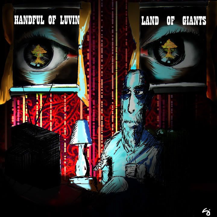
Tuesday, March 13, 2007cd cover v. 2
Comments:
the mushroom clouds in the eyes is a pretty neat idea, and i still love the background wallpapering, but i vastly prefer the octopi cover. what did handful of luvin say?
im just making a few differerent covers to give them some choices. i still think the octopi is my favorite, as well.
i like how it looks like you are looking through a hole, or maybe an old tv... at a lonely man watching the tv.
I love this image, but I think the octopi works better as an album cover. To me this image feels more storyboard like. Perhaps a still from the bands music video? You should pitch the idea.
Post a Comment
<< Home |
